How to Read Your Hiring Reports
Analyse candidate flow, score distribution, and interview activity for each opening.
Overview
View detailed analytics for each opening to understand your hiring funnel.
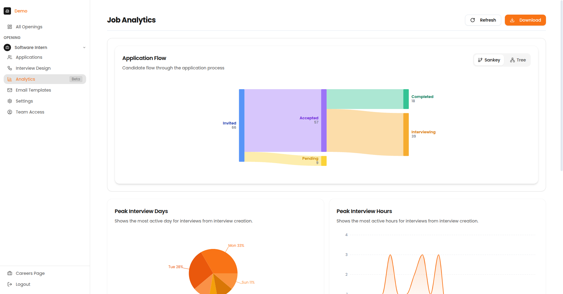
The Job Analytics page showing Application Flow, Peak Interview Days, Peak Interview Hours, and Score Distribution.
Summary Cards
| Card | What It Shows |
|---|---|
| Total Candidates | Number of applications received |
| Completion Rate | Percentage who finished the interview |
| Average Score | Mean AI rating across all candidates |
| Top Performers | Candidates scoring 4+ out of 5 |
Candidate Flow Chart
The candidate flow chart visualises how candidates move through your pipeline, showing where candidates drop off and conversion rates between stages.
Reading the Chart
| Element | Meaning |
|---|---|
| Thick flows | More candidates took this path |
| Thin flows | Fewer candidates |
| Red/Orange | Drop-off points |
| Green | Successful completions |
Flow Stages
- Start - Total candidates invited
- First node - Candidates who opened the link
- Middle nodes - Progress through interview stages
- End nodes - Completed, abandoned, or expired
Identifying Issues
If you see a large drop-off at a specific stage, investigate why. Common causes include:
- Interview too long
- Technical difficulties
- Poor candidate experience
- Unclear instructions
Score Distribution
Understand how candidates are performing across your interviews.
Distribution Chart
The histogram shows the spread of candidate scores:
- X-axis: Score ranges (1.0-1.9, 2.0-2.9, etc.)
- Y-axis: Number of candidates in each range
- Bell curve: Indicates typical distribution
How Candidates Compare
| Percentile | Meaning |
|---|---|
| Top 10% | Exceptional candidates |
| Top 25% | Strong performers |
| Top 50% | Above average |
| Bottom 50% | Below average |
What the Distribution Tells You
| Pattern | What It Means |
|---|---|
| Most candidates scored high | Scoring criteria may be too easy — consider making them more specific |
| Most candidates scored low | Scoring criteria may be too hard — consider adjusting difficulty |
| Even spread across scores | Well-calibrated criteria — this is the ideal pattern |
| Two separate groups of scores | Two distinct candidate pools — may indicate different sourcing channels |
Peak Activity Tracking
The activity heatmap shows when candidates take interviews by day of week and hour of day.
Heatmap Components
- Rows: Days of the week (Monday - Sunday)
- Columns: Hours of the day (12am - 11pm)
- Colour intensity: Number of interviews during that time slot
How to Use This Data
| Goal | Action |
|---|---|
| Optimise reminder timing | Send reminders 1-2 hours before peak activity |
| Set better deadlines | Align deadlines with high-activity periods |
| Plan review sessions | Schedule reviews when new completions are likely |
| Identify patterns | Note if weekends or evenings are popular |
Using Analytics Effectively
Best Practices
- Monitor funnel drop-off - If many candidates drop out at a specific stage, investigate why
- Track score trends - Consistently low scores may indicate sourcing issues
- Optimise timing - Schedule reviews during your peak activity periods
- Plan capacity - Use completion data to forecast review workload
- Compare openings - Look for patterns across similar roles
Common Questions
Why is my completion rate low?
Common causes:
- Interview too long (keep under 45 minutes)
- Technical issues (check browser requirements in communications)
- Candidates need reminders (send follow-ups)
- Link expiration (extend deadlines if needed)
Why are scores clustered at one end?
Check your scoring criteria:
- Too easy: Most candidates score 4+
- Too hard: Most candidates score below 3
- Adjust criteria or question difficulty accordingly
When do most candidates interview?
Check the Peak Activity heatmap. Most candidates complete interviews:
- Evenings (6-9 PM) on weekdays
- Weekend mornings
- Lunch hours (12-1 PM)